Creating a Gatsby Blog From Scratch
2020-02-23
What will we be doing?
We will be building a blog website with gatsbyjs, react and markdown files.
The blog will contain the following features:
Posts are written in markdown files
Typography
Fluid image loading
Code syntax hightlighting with prismjs
SCSS for styling
What you should know?
Basics of javascript, react and css/scss. Markdown syntax to write blog posts.
Install the gastby CLI
npm install -g gatsby-cliInstall the basic gatsby starter
npx gatsby new myBlogCheck if everything is working. The server should start gatsby in dev mode.
npm run developIf you already have something running on port 8000, you can specify a port by modifying the develop script in your package.json file. While in the package.json file you may as well go ahead and change the name, description, author, etc...
...
  "scripts": {
    "build": "gatsby build",
    "develop": "gatsby develop -p 8888",
...
Finally, we want to start with a completely blank project. Remove everything from src as well as the gatsby config-files
rm -rv src
rm gatsby-ssr.js gatsby-node.js gatsby-config.js gatsby-browser.js
Create the folder structure and blank config files
mkdir src src/components src/images src/pages src/templates
touch gatsby-node.js gatsby-config.js gatsby-browser.js
Configure the sharp plugins else your gatsby will crash.
module.exports = {
  plugins: [`gatsby-transformer-sharp`, `gatsby-plugin-sharp`],
}
Make sure everything works. Start the dev server.
npm run developCreating the home page
touch src/pages/index.jsimport React from "react"
const Index = () => {
return (
<div>
<h1>Welcome to the home page</h1>
</div>
)
}
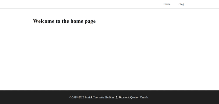
export default IndexNow go to localhost:8000 (or whatever you set it up to). You should see your home page.
Installing Sass for styling
We will be using SCSS to style our pages and components.
npm install --save node-sass gatsby-plugin-sassAdd sass to your gatsby-config.js file.
module.exports = {
  plugins: [
    `gatsby-transformer-sharp`,
    `gatsby-plugin-sharp`,
    `gatsby-plugin-sass`,
  ],
}
Creating our website layout
Create the following files in src/components
- container.js
- container.scss
- header.js
- header.scss
- footer.js
- footer.scss
- layout.js
- layout.scss
import React from "react"
import "./container.scss"

const Container = ({ children }) => {
  return <div className="container">{children}</div>
}

export default Container.container {
max-width: 950px;
margin: 0 auto;
padding: 2rem;
width: 100%;
}import React from "react"
import { Link } from "gatsby"
import Container from "./container"
import "./header.scss"
const Header = () => {
return (
<header className="header">
<Container>
<nav>
<ul>
<li>
<Link to="/">Home</Link>
</li>
<li>
<Link to="/blog">Blog</Link>
</li>
</ul>
</nav>
</Container>
</header>
)
}
export default Header.header {
border-bottom: 1px solid rgba(0, 0, 0, 0.2);
.container {
padding: 0;
}
nav ul {
display: flex;
flex-direction: row;
flex-wrap: wrap;
list-style: none;
padding: 0;
margin: 0;
justify-content: flex-end;
align-items: center;
}
ul li {
margin-right: 2rem;
padding: 1rem 0;
}
ul a {
text-decoration: none;
color: #202020;
padding: 0.5rem;
cursor: pointer;
border-bottom: 2px solid transparent;
transition: border-bottom 0.3s ease-in-out;
}
ul a:hover {
border-bottom: 2px solid blue;
}
}import React from "react"
import Container from "./container"
import "./footer.scss"
const Footer = () => {
return (
<footer className="footer">
<Container>
<p>
© 2018-2020 Patrick Touchette. Built in{" "}
<span role="img" aria-label="mountain">
🗻
</span>{" "}
Bromont, Quebec, Canada.
</p>
</Container>
</footer>
)
}
export default Footer.footer {
text-align: center;
background: #202020;
color: white;
}import React from "react"
import Header from "./header"
import Container from "./container"
import Footer from "./footer"
import "./layout.scss"
const Layout = ({ children }) => {
return (
<div className="layout">
<Header />
<Container>{children}</Container>
<Footer />
</div>
)
}
export default Layout.layout {
display: flex;
flex-direction: column;
min-height: 100vh;
justify-content: flex-start;
.footer {
margin-top: auto;
justify-self: flex-end;
}
}Ok now that that is out of the way lets build our home and blog pages.
Creating Home page and blog page
Lets update the index pages to use our newly created Layout component.
import React from "react"
import Layout from "../components/layout"

const Index = () => {
  return (
    <Layout>
      <h1>Welcome to the home page</h1>
    </Layout>
  )
}

export default Index
Finally lets create the blog page wich will contain the list of blog posts.
import React from "react"
import Layout from "../components/layout"

const Blog = () => {
  return (
    <Layout>
      <h1>Blog page</h1>
    </Layout>
  )
}

export default Blog
You should now have a page that looks like this.

Installing Gatsby Plugins
We will be sourcing our posts from markdown files. There is a list of plugins we should install and configure to get all of this to work. Some of these may already be installed from the gatsby starter.
Most notably we will have syntax highlighting for code with prismjs, typography from gatsy-plugin-typography and posts data with the gatsby-transformer-remark. Make sure all of the plugins are installed.
gatsby-source-filesystemgatsby-plugin-sharpgatsby-transformer-remarkgatsby-remark-imagesgatsby-remark-relative-imagesgatsby-remark-prismjsprismjsgatsby-plugin-typographyreact-typographytypography
npm install --save gatsby-source-filesystem gatsby-plugin-sharp
npm install --save gatsby-transformer-remark
npm install --save gatsby-remark-images gatsby-remark-relative-images
Configuring the Typography plugin
Start by installing these packages.
npm install --save gatsby-plugin-typography react-typography typographyTo get typography to work, you can set it all up yourself of rather use one of the many preconfigured themes.
Check out the themes here https://kyleamathews.github.io/typography.js/
I will be using the default theme.
Create a typography file in src/styles
touch src/styles/typography.jsimport Typography from "typography"
const typography = new Typography()
// Export helper functions
export const { scale, rhythm, options } = typography
export default typographyand we need to configure the typography plugin inside gastby-config.js.
module.exports = {
  plugins: [
    `gatsby-transformer-sharp`,
    `gatsby-plugin-sharp`,
    `gatsby-plugin-sass`,
    {
      resolve: `gatsby-plugin-typography`,
      options: {
        pathToConfigModule: `src/styles/typography`,
      },
    },
  ],
}
Stop the server and restart it server with npm run develop
You should see that the typography has been applied. Since it applies margin-bottom to <p> and <li> elements you may want to go back to the header.scss and footer.scss files to add a margin-bottom: 0 to those elements.
Configuring the posts with the remark plugin
First lets create some posts. We will keep our posts in a folder called blog.
mkdir blog blog/post1 blog/post2
touch blog/post1/post1.md blog/post2/post2.md
Create two posts with the following content
---
title: "Post number 1"
date: "2020/02/20"
slug: "post1"
---

this is post 1 hehehehe

## Title yeah wooooooh---
title: "Post number 2"
date: "2020/02/20"
slug: "post2"
---
this is post 2 hehehehe
## Title for post two yeah woooooohLet's create the blog template. This is a component that will be used at build time to generate a new page for each post.
touch src/templates/blog-post.jsimport React from "react"
import Layout from "../components/layout"
import { graphql } from "gatsby"
const BlogPost = ({ data }) => {
const { frontmatter, html } = data.markdownRemark
return (
<Layout>
<h1>{frontmatter.title}</h1>
<p>{frontmatter.date}</p>
<div dangerouslySetInnerHTML={{ __html: html }}></div>
</Layout>
)
}
export default BlogPost
export const query = graphql`
query($slug: String) {
markdownRemark(fields: { slug: { eq: $slug } }) {
frontmatter {
title
date
}
html
fields {
slug
}
}
}
`Then we should configure the remark plugins inside the gastby-config-file. Make sure to install these plugins if you have not already.
npm install --save gatsby-source-filesystem
npm install --save gatsby-plugin-sharp
npm install --save gatsby-transformer-remark
npm install --save gatsby-remark-images
npm install --save gatsby-remark-relative-imagesmodule.exports = {
plugins: [
`gatsby-transformer-sharp`,
`gatsby-plugin-sharp`,
`gatsby-plugin-sass`,
{
resolve: `gatsby-plugin-typography`,
options: {
pathToConfigModule: `src/styles/typography`,
},
},
{
resolve: "gatsby-source-filesystem",
options: {
name: "blog",
path: `${__dirname}/blog/`,
},
},
{
resolve: `gatsby-transformer-remark`,
options: {
plugins: [
"gatsby-remark-relative-images",
{
resolve: "gatsby-remark-images",
options: {
maxWidth: 750,
linkImagesToOriginal: false,
},
},
],
},
},
],
}Up next we will configure the gatsby-node.js file.
const path = require("path")

module.exports.onCreateNode = ({ node, actions }) => {
  const { createNodeField } = actions

  if (node.internal.type === "MarkdownRemark") {
    // console.log("node", JSON.stringify(node, undefined, 4))

    const slug = node.frontmatter.slug
    console.log("slug", slug)

    createNodeField({
      node,
      name: "slug",
      value: slug,
    })
  }
}

module.exports.createPages = async ({ graphql, actions }) => {
  const { createPage } = actions

  // MARKDOWN BLOG
  const blogTemplate = path.resolve("./src/templates/blog-post.js")
  const res = await graphql(`
    query {
      allMarkdownRemark {
        edges {
          node {
            fields {
              slug
            }
          }
        }
      }
    }
  `)

  res.data.allMarkdownRemark.edges.forEach(edge => {
    createPage({
      component: blogTemplate,
      path: `/blog/${edge.node.fields.slug}`,
      context: {
        slug: edge.node.fields.slug,
      },
    })
  })
}
npm run develop should now generate the blog posts
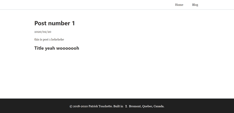
You can visit it at `localhost:8888/blog/post1

Creating the blog posts page
Edit the src/pages/blog.js file
import React from "react"
import { Link, useStaticQuery, graphql } from "gatsby"
import Layout from "../components/layout"
import "./blog.scss"

const BlogPage = () => {
  const data = useStaticQuery(graphql`
    query {
      allMarkdownRemark {
        edges {
          node {
            frontmatter {
              title
              date
            }
            excerpt
            html
            fields {
              slug
            }
          }
        }
      }
    }
  `)

  const { edges } = data.allMarkdownRemark

  const posts = edges.map(edge => {
    const { frontmatter, excerpt, fields } = edge.node
    return (
      <li key={frontmatter.title} className="post">
        <Link to={`/blog/${fields.slug}`}>
          <h2>{frontmatter.title}</h2>
        </Link>
        <p className="date">{frontmatter.date}</p>
        <p>{excerpt}</p>
        <Link to={`/blog/${fields.slug}`}>See more...</Link>
      </li>
    )
  })

  return (
    <div className="blog-page">
      <Layout>
        <h1>Blog</h1>
        <ul>{posts}</ul>
        <p>
          Go back <Link to="/">home</Link>
        </p>
      </Layout>
    </div>
  )
}

export default BlogPage
create the blog.scss file for the styling of the blog page
touch src/pages/blog.scss.blog-page {
ul {
list-style: none;
margin: 0;
}
.post {
margin: 2rem 0rem;
padding: 1rem;
background: #f4f4f4;
a {
color: #202020;
text-decoration: none;
display: block;
}
a:hover {
color: blue;
}
h2 {
margin-bottom: 0.7rem;
}
.date {
color: #777777;
font-size: 0.8;
font-style: italic;
}
}
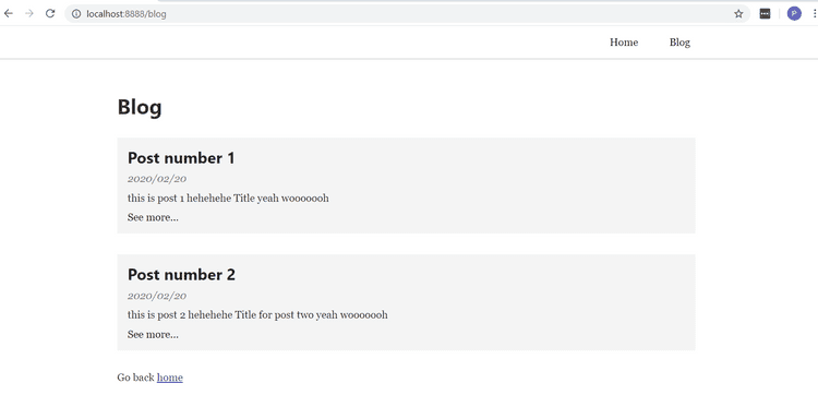
}This is what the blog page should look like

Configuring Primsjs syntax highlighting
finally we want to add syntax highlighting for code blocks.
Install the primsjs and gatsby-remark-prismjs plugin
npm install --save gatsby-remark-prismjs prismjsmodule.exports = {
plugins: [
`gatsby-transformer-sharp`,
`gatsby-plugin-sharp`,
`gatsby-plugin-sass`,
{
resolve: `gatsby-plugin-typography`,
options: {
pathToConfigModule: `src/styles/typography`,
},
},
{
resolve: "gatsby-source-filesystem",
options: {
name: "blog",
path: `${__dirname}/blog/`,
},
},
{
resolve: `gatsby-transformer-remark`,
options: {
plugins: [
"gatsby-remark-relative-images",
{
resolve: "gatsby-remark-images",
options: {
maxWidth: 750,
linkImagesToOriginal: false,
},
},
{
resolve: `gatsby-remark-prismjs`,
},
],
},
},
],
}To actually get the css style, choose a theme and require it in gatsby-browser.js
require("prismjs/themes/prism-tomorrow.css")We can overide the css from prism by require an additional css file after we required the prism theme.
Here is what my final gastby-browser looks like.
.filename {
  background: #202020;
  color: yellow;
  font-style: italic;
  padding: 0.5rem;
}

pre[class*="language-"] {
  margin: 0;
  margin-bottom: 1.45rem;
}
I also added some normalize and reset css to my gatsby-browser file. Here is what the final file looks like.
import "./src/styles/normalize.css"
import "./src/styles/reset.css"
require("prismjs/themes/prism-tomorrow.css")
require("./src/styles/prism-override.css")
What's left ?
There are still many things we could add to improve our blog. We could configure SEO, create a tag and category system for the posts, add some styling, pages, and much much more...
References
https://www.gatsbyjs.org/docs/quick-start
https://kyleamathews.github.io/typography.js/